Case study
Chicka: eighteen packs, one set of rules
Chicka's baked corn snacks come in different shapes, but every pack looked the same, and the trade took the whole range for one product. We wrote the rules that tell the lines apart, then designed the range to them.
- Client
- Americana Snacks
- Scope
- Packaging architecturePack designBrand character
- Range
- 7 lines, 18 packs
- Timeline
- Brief, November 2025Direction approved, February 2026
- Status
- On shelf


In short
The problem
Different snacks, one pack. Every line shared a layout, a character and much the same colours, so shoppers and traders read the range as a single product.
The idea
A snack is chosen in three steps: the family, the format, the flavour. Each step gets its own place on the pack and its own rule.
The work
An architecture with one core line and six formats, one cheetah in place of four, and eighteen packs on two layouts.
01Starting point
Five snacks in one pack
Chicka is Americana's range of baked corn snacks. Crunchy, a baked stick, is the established line. Puffs, Puffcorn, Rings and Boom are newer, and each is a different shape with a different bite.
The packs did not show it. Every line wore the same layout, the same cheetah and nearly the same colours, with its own name set small under a large Chicka logo.
Shoppers could not tell one product from the next. Neither could traders, who took the lines for one product in several colours. That held back the range's distribution.

Rings

Rings

Puffcorn

Puffcorn

Puffcorn

Puffcorn

Puffs

Puffs

Puffs
Crunchy

Crunchy

Crunchy

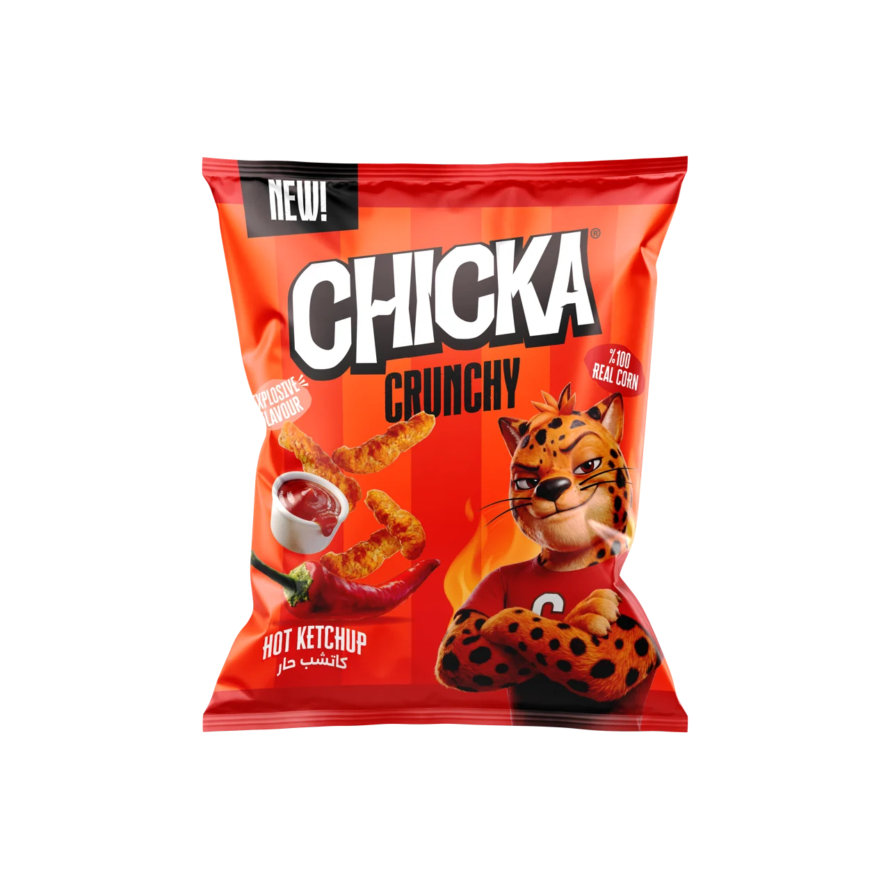
Crunchy, Hot Ketchup
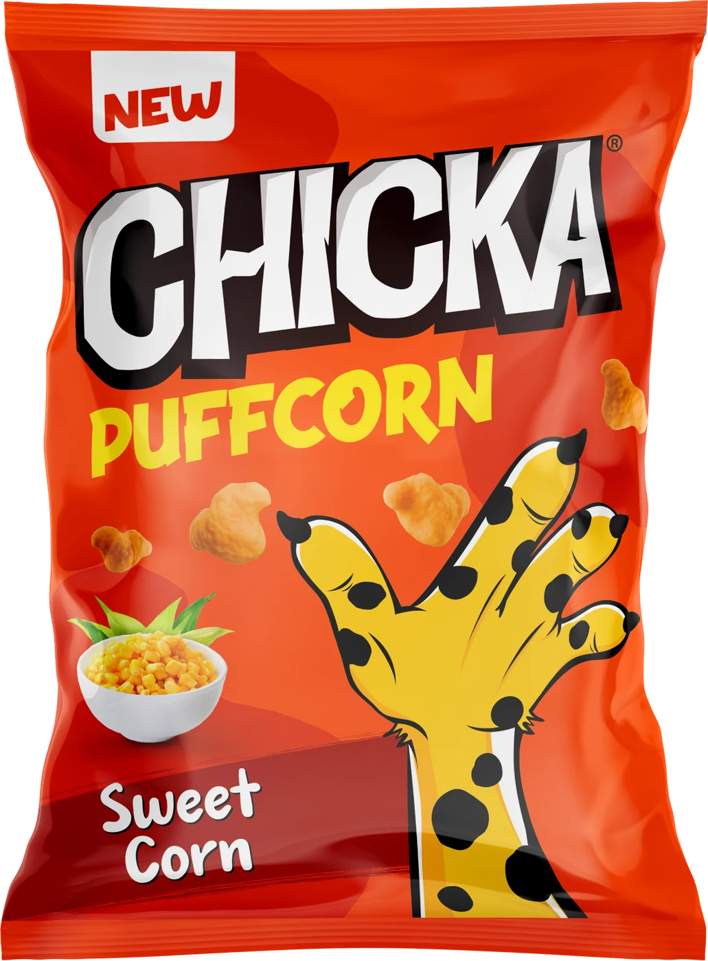
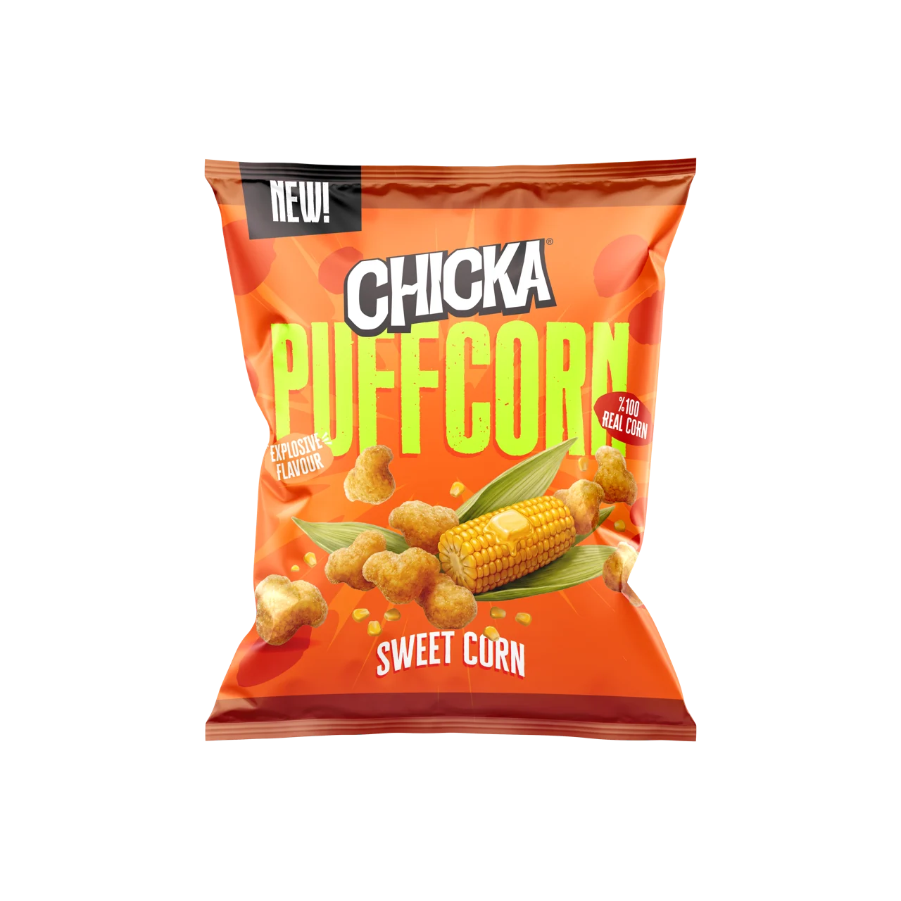
Puffcorn, Sweet Corn


Rings, Sweet Chili
02The brief
“One loud block, not a well-defined portfolio”
That is how Americana's brief described its own range in November 2025. It asked for three things: a segmentation that gives every line a clear identity inside one family; a visual hierarchy for each segment, covering logo, product shape, flavour and character; and rules that new products and limited editions can follow.
It also set the measure of success. A shopper should understand how the products differ from the pack alone.
03The audit
Twelve bags, one metre, three seconds
We looked at the range the way a shopper does, from a metre away and for three seconds, and then counted what we saw.
12 of 12
Hierarchy
On every bag the Chicka logo was the largest thing on the face. The line and the flavour came after it.
5 of 12
Colour
Five of the twelve bags were red and three were gold.
4
Character
One cheetah, drawn in four unrelated styles.
10–40%
Flavour
The space given to the flavour ran from a tenth of the pack face to four tenths, by our estimate.
The pack answered the wrong question first
A pack has about three seconds to answer three questions: whose is it, what shape is it, what flavour is it. The old packs spent their largest element on the first and left the other two small.
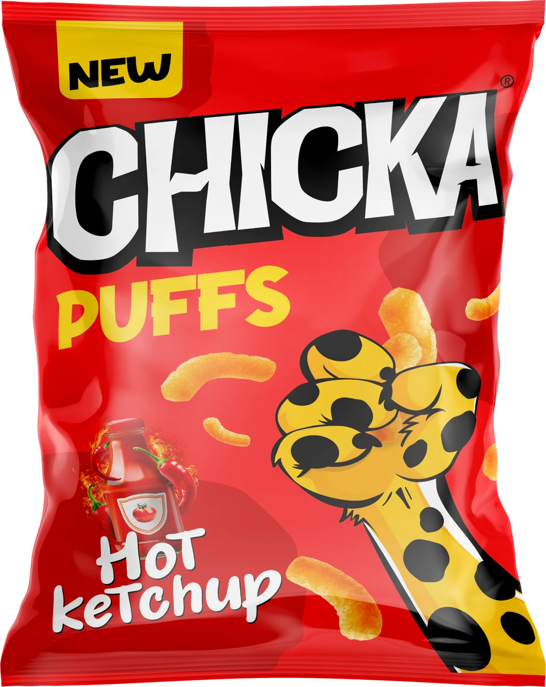
The Chicka logo
The largest thing on the pack. It says who makes this before what it is.
The line name
Small, under the logo, in a weaker colour.
The flavour
A different size and a different place on each line.
The character
A different drawing on each line.
Colour had no job
Nobody had decided what colour was for, so each pack chose its own. Eight of the twelve bags ended up in two colours.
12 bags
- 5 bags: Red
- 3 bags: Gold
- 1 bags: Blue
- 1 bags: Teal
- 1 bags: Green
- 1 bags: Purple
A mascot with four faces
On the Puffs pack the cheetah was a flat drawing. On Crunchy he was a cropped head. In campaigns he was two different 3D figures. There was no reference model, so every new use redrew him.
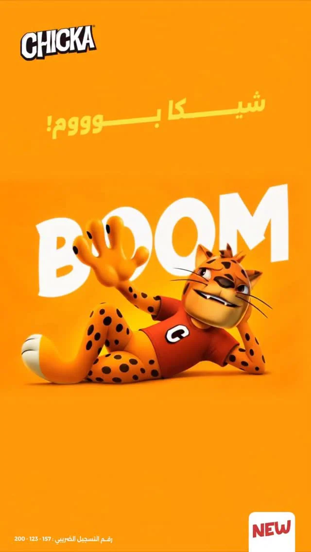
3D cartoonAdvertising
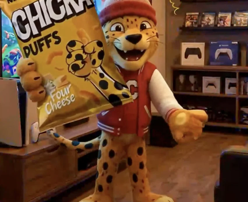
Semi-realistic 3DCampaign art
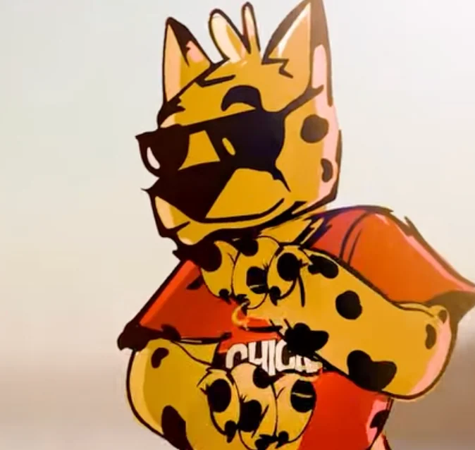
Flat drawingOn the Puffs pack

Cropped headOn the Crunchy pack
The flavour moved from pack to pack
The client's research put flavour first among the reasons people choose a snack like this. On the old packs it had no set format, size or position.
What we kept
Not everything needed fixing. Five things were working and stayed. Five were rebuilt.
Kept
The cheetah
The most recognised thing Chicka owns.
The wordmark
Already consistent everywhere.
The energy
The character of the brand suits the people who eat it.
The shapes
Different enough to tell apart, once the pack lets you see them.
The short names
Puffs, Rings, Boom, Crunchy. Easy to say and to remember.
Rebuilt
Colour
So that it signals the flavour.
Hierarchy
The format name becomes the loudest thing on a format pack.
Character
One reference model, set expressions, set sizes.
Layout
One fixed layout per tier.
Flavour
One lockup, one position.
Chicka did not have a design problem. It had a systems problem.
Every pack had made its own rules. The range competed with itself more than with the shelf around it.
04The rule
Three decisions in three seconds
The architecture rests on one observation about how a snack is bought. A shopper recognises the family, picks a format and chooses a flavour, in that order, in about three seconds. So each of the three decisions gets its own part of the pack, and nothing else may compete with it.
0–1 sec
Recognise the family
“This is Chicka.”
Answered by
1–2 sec
Select the format
“I want puffs.”
Answered by
2–3 sec
Choose the flavour
“Give me cheese.”
Answered by
05The model
Three ways to organise the range
We set three models against that rule. Keeping Chicka dominant, with the lines as descriptors, is what the range already had. Letting each line stand alone would give up the one name people know. The third keeps the family and lets the formats speak.
01
Monolithic
Chicka dominates. The lines are descriptors.
Rejected
No difference between formats, and a shopper chooses the format before the flavour.
02
House of brands
Each line stands alone. Chicka disappears.
Rejected
It gives up the Chicka name and leaves five brands to support instead of one.
03
Hybrid
One family, two tiers.
Selected
The core carries the name. The formats lead with their own.
One family, two tiers
Crunchy is the core. It leads with the Chicka name and carries the cheetah. The six formats lead with their own names, under the Chicka wordmark. Shells and Pops were not part of the range we were briefed on. They were built on the same layout as the other formats.
Masterbrand

The core
Chicka leads

Crunchy
Baked sticks
The formats
The format leads

Puffs
Puffed curls

Puffcorn
Popped-kernel puffs

Rings
Hoops
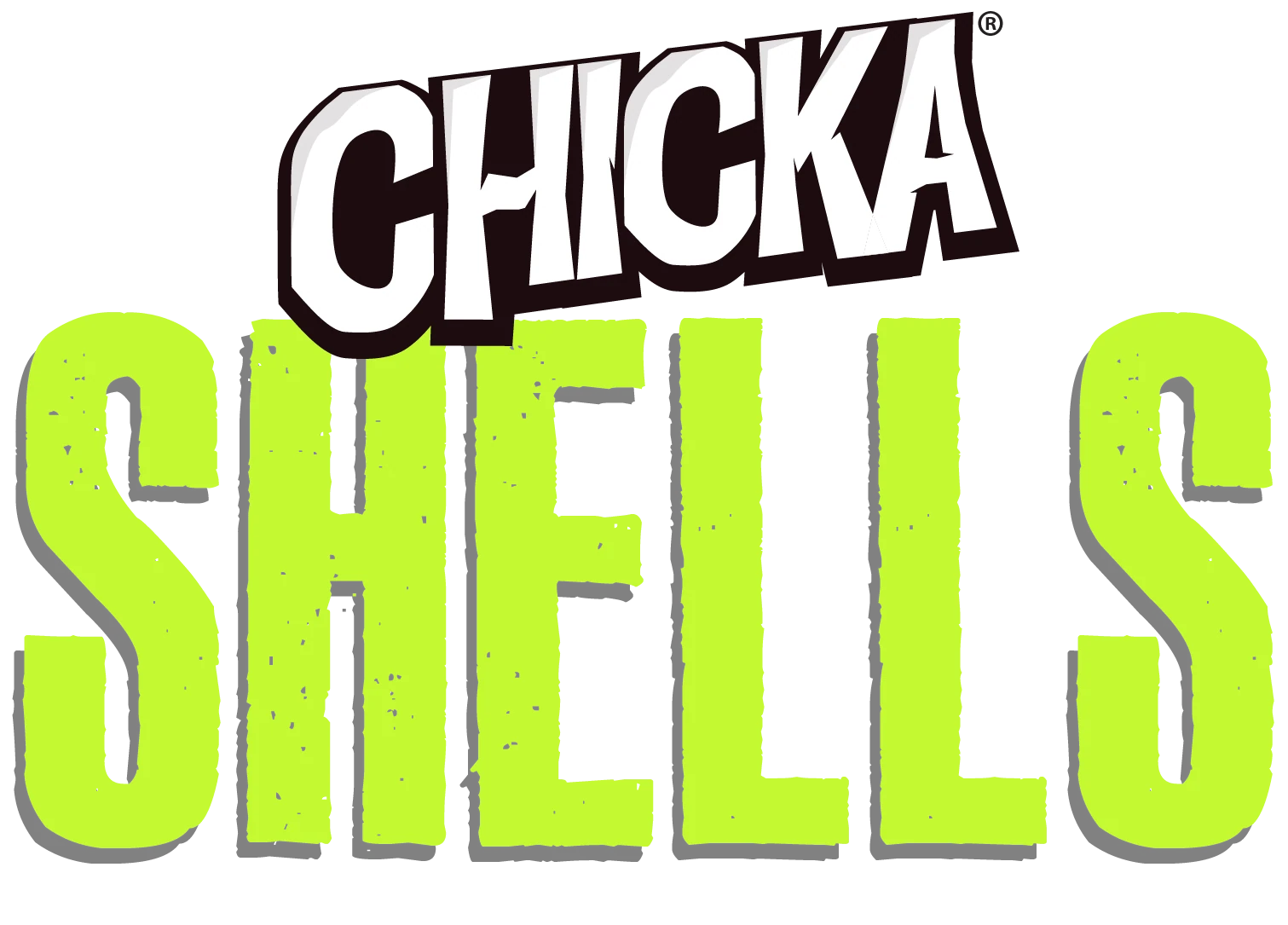
Shells
Ridged cups

Pops
Round balls
Boom
Bite-size pieces
06The pack
Two layouts, nothing decided pack by pack
Each tier has one fixed layout. On a format pack the format name is the largest thing on the face. The Chicka wordmark sits above it, the snack below it and the flavour at the foot. A designer adding a flavour changes the colour, the picture and one name. Everything else stays where it is.

Chicka wordmark
The family name, on every pack, above the format.
Format name
The largest thing on the pack. It answers what is this first.
Product picture
The shape of the snack, with the ingredients of the flavour.
Flavour name
Always at the foot, always in the same lockup.
Claim
Two small marks at the edges. They never compete with the name.
Pattern
The cheetah's spots, in the colour of the flavour.
The core against the formats
The two tiers differ in five ways, and each difference is a rule.
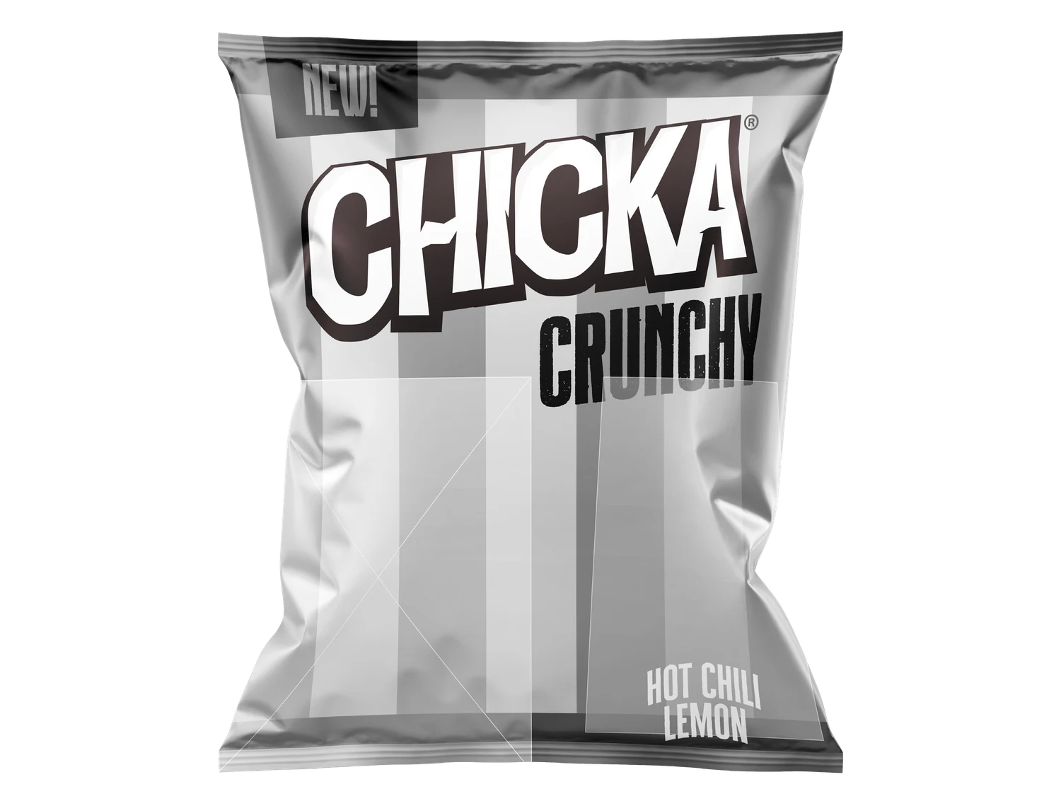 | 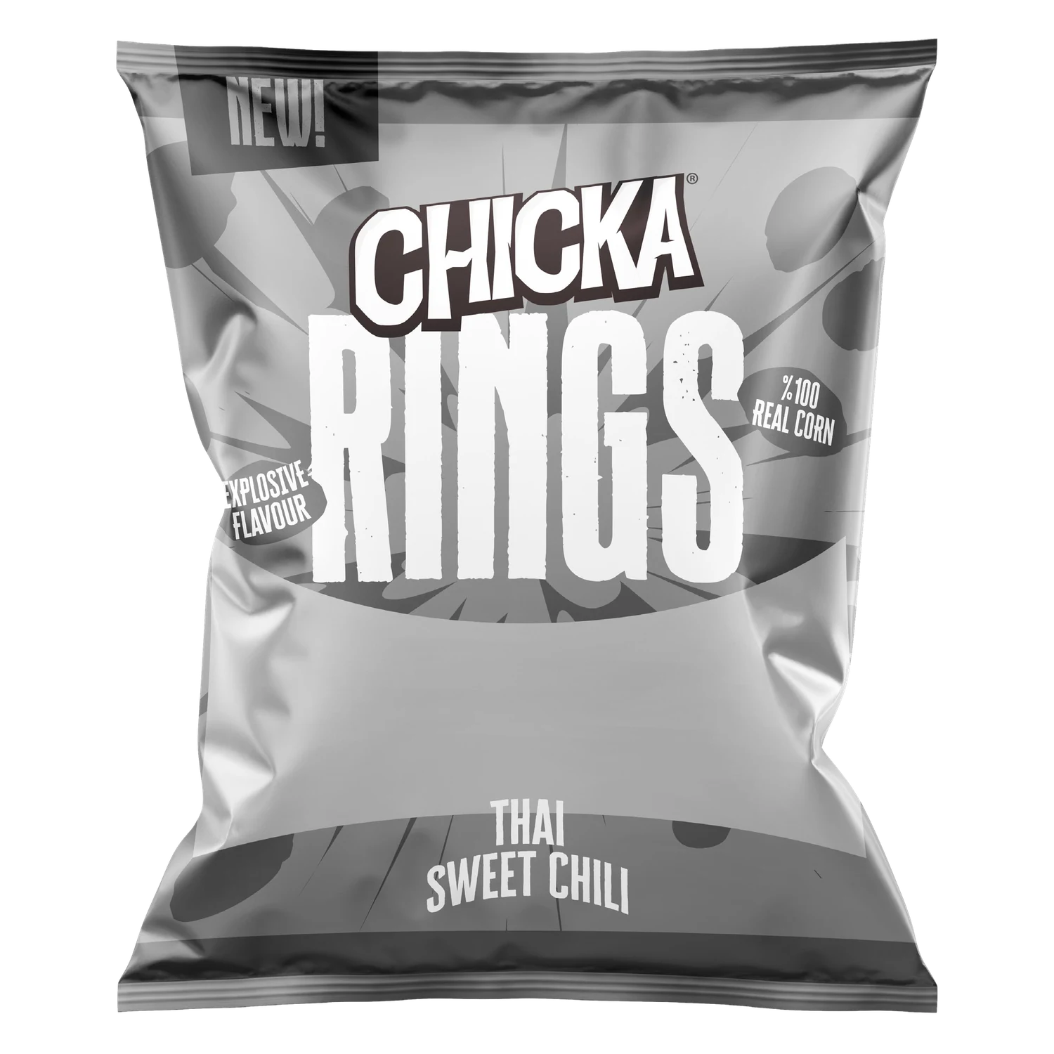 | |
|---|---|---|
| Loudest element | The Chicka wordmark | The format name |
| Character | The cheetah, on pack | His spots only |
| Background | Stripes | Cheetah skin |
| Product picture | At the left, beside the cheetah | Across the centre |
| Flavour name | Foot of the pack, left | Foot of the pack, centre |
07Colour
Colour marks the flavour, not the line
On the old packs colour was decoration. Now it carries information. No line owns a colour: Puffcorn alone comes in four. A flavour does: Four Cheese is the same gold on Puffs and on Rings. It works the other way round too. Every gold pack is a cheese, and every red one is tomato or chilli.
Some colours carried over from the old packs. Puffcorn Cream Cheese is still blue, and Rings Sweet Chili is still purple.
Crunchy
- Cheddar Cheese
- Hot Lemon
- Hot Ketchup
Puffs
- Four Cheese
- Harissa Ketchup
- Chipotle Sauce
Puffcorn
- Sweet Corn
- Twisted Lemon
- Cream Cheese
- Red Hot Pepper
Rings
- Four Cheese
- Thai Sweet Chili
Shells
- Truffle Cheese
- Ghost Pepper Lime
Pops
- Spiced Cheese
- Tomato Jalapeño
Boom
- Cheese Madness
- Tomato Ketchup
08The character
One cheetah where there were four
The cheetah is the most recognised thing Chicka owns. We did not redesign him. We developed one reference model from what people already knew: the orange and gold coat, the black spots, the red shirt with the C. Every use now starts from that model.

Full bodyCore packs, campaigns, point of sale

PeekingSmall formats, supporting placements

Mark onlyCorporate and digital uses

SkinFormat pack backgrounds, trade material
On pack he appears only on the core. The formats carry his spots, so the family holds together without drawing him on every bag.
09The packs
Seven lines, eighteen packs
Design development took the approved direction through the whole range, one line at a time. Each flavour has one picture of the snack with its ingredients, used the same way on every pack of its tier.
Crunchy
Baked sticks
The core
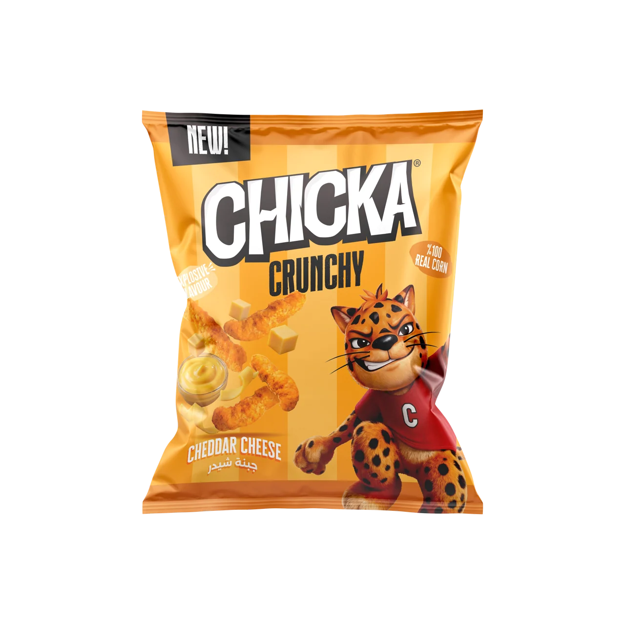

Cheddar Cheese
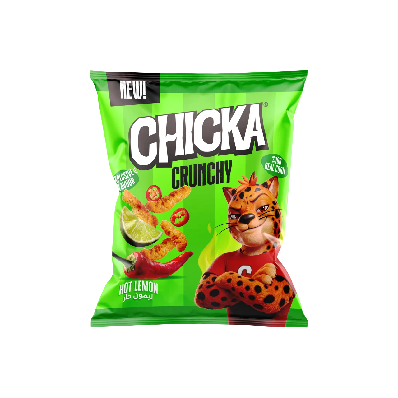

Hot Lemon
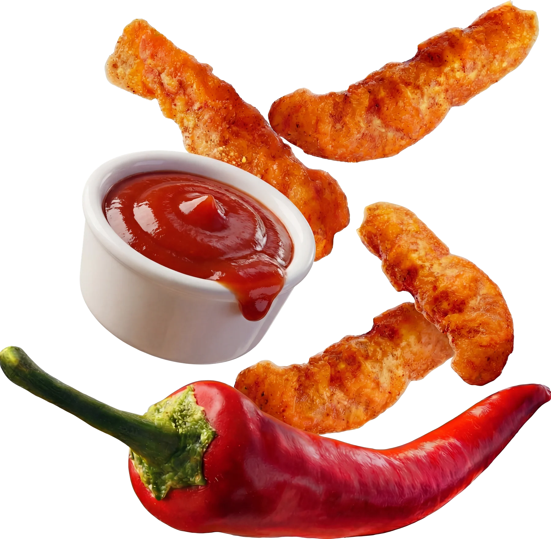
Hot Ketchup
Puffed curls
Format
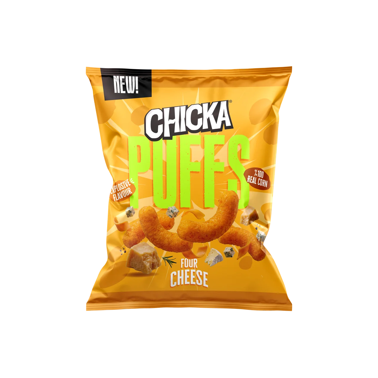
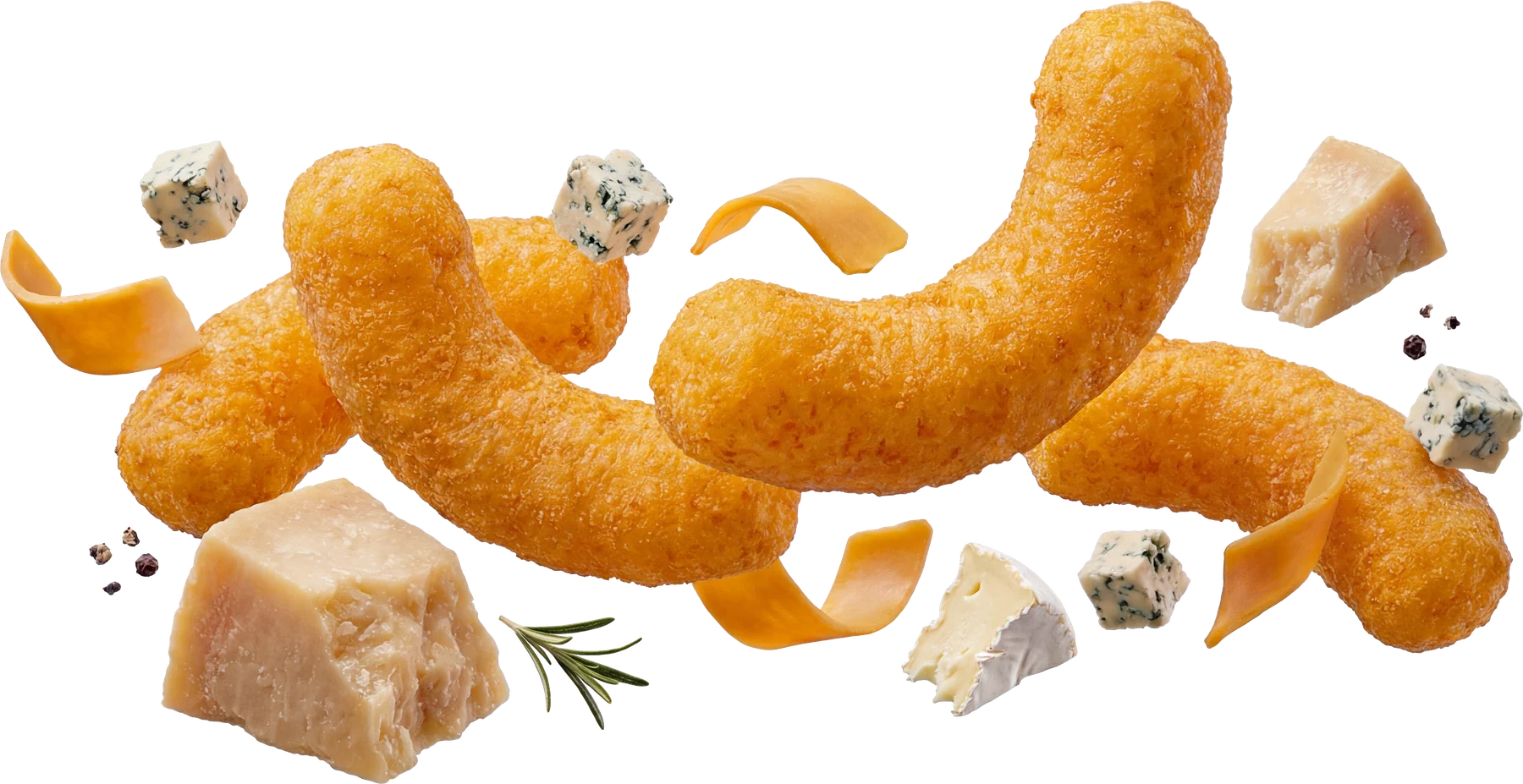
Four Cheese
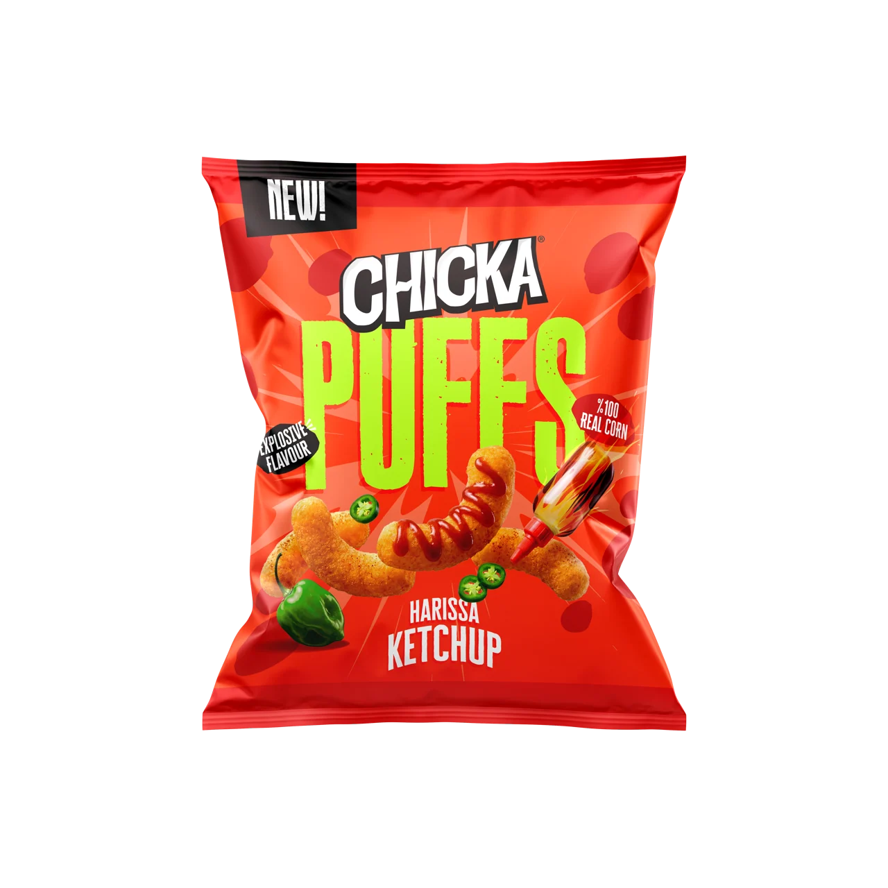

Harissa Ketchup
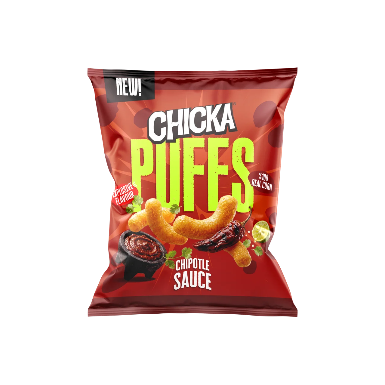
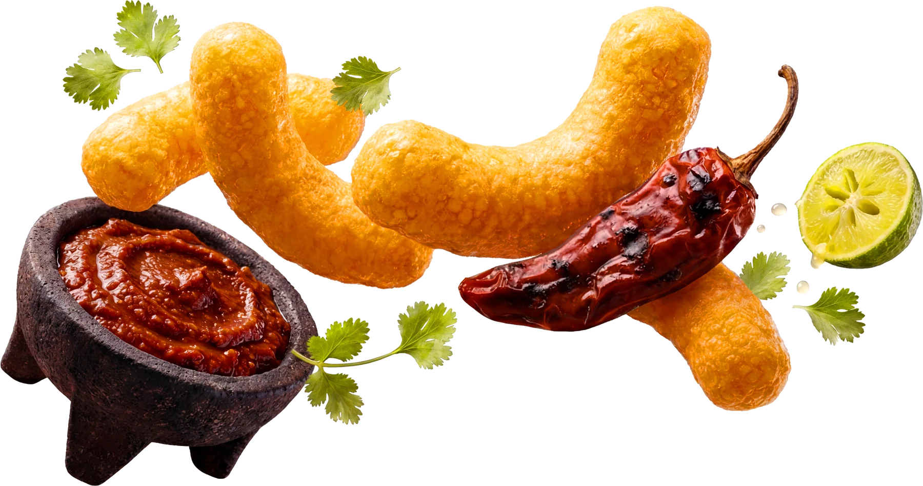
Chipotle Sauce
Popped-kernel puffs
Format

Sweet Corn
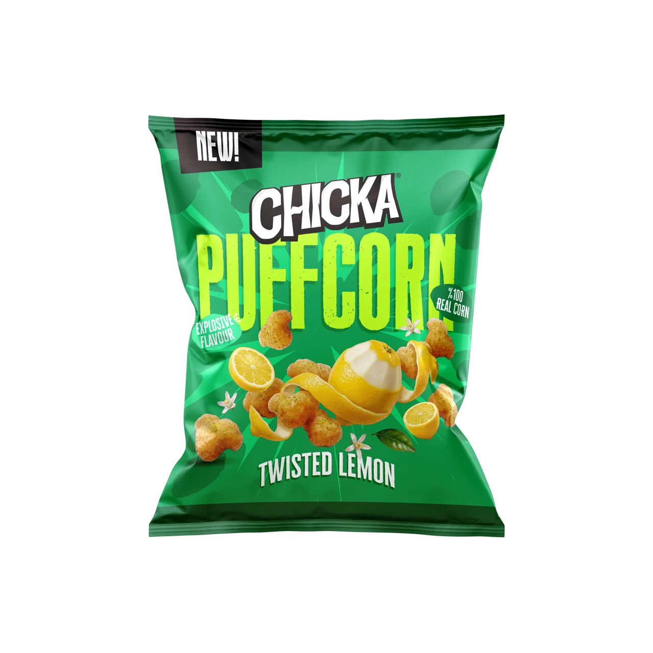
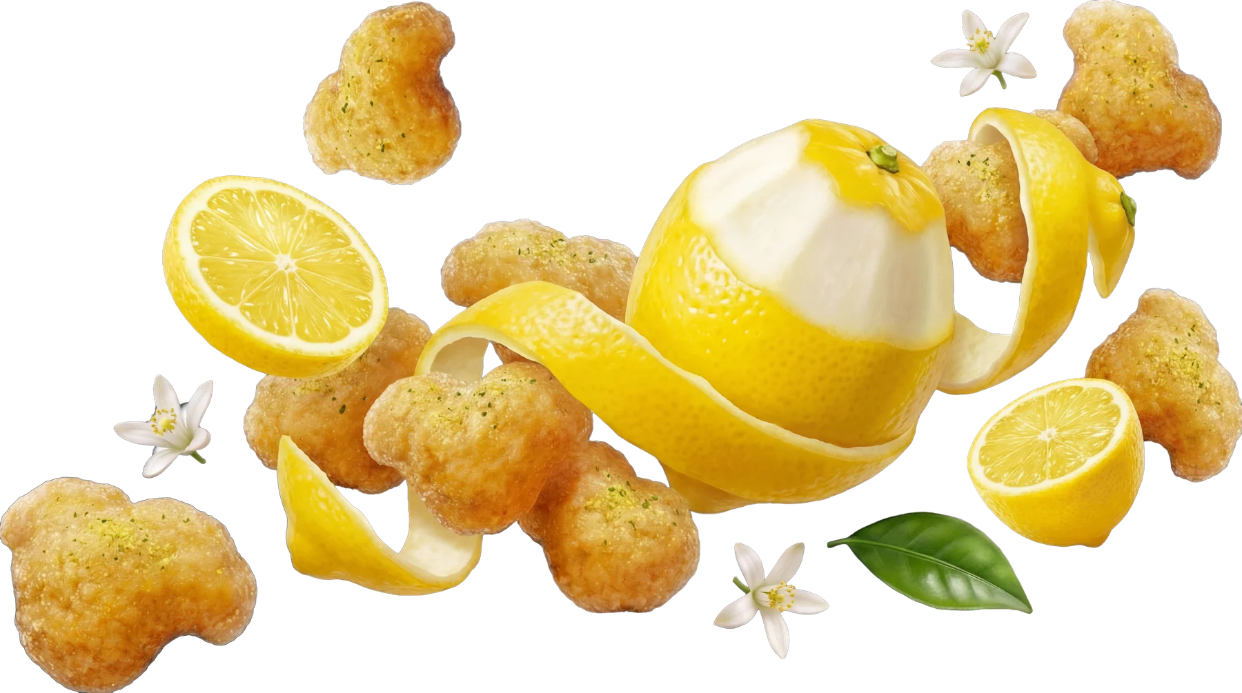
Twisted Lemon
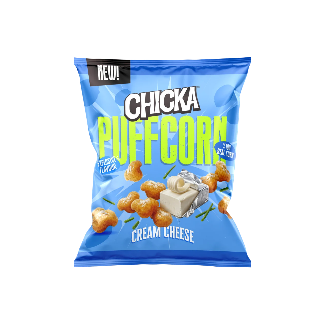

Cream Cheese
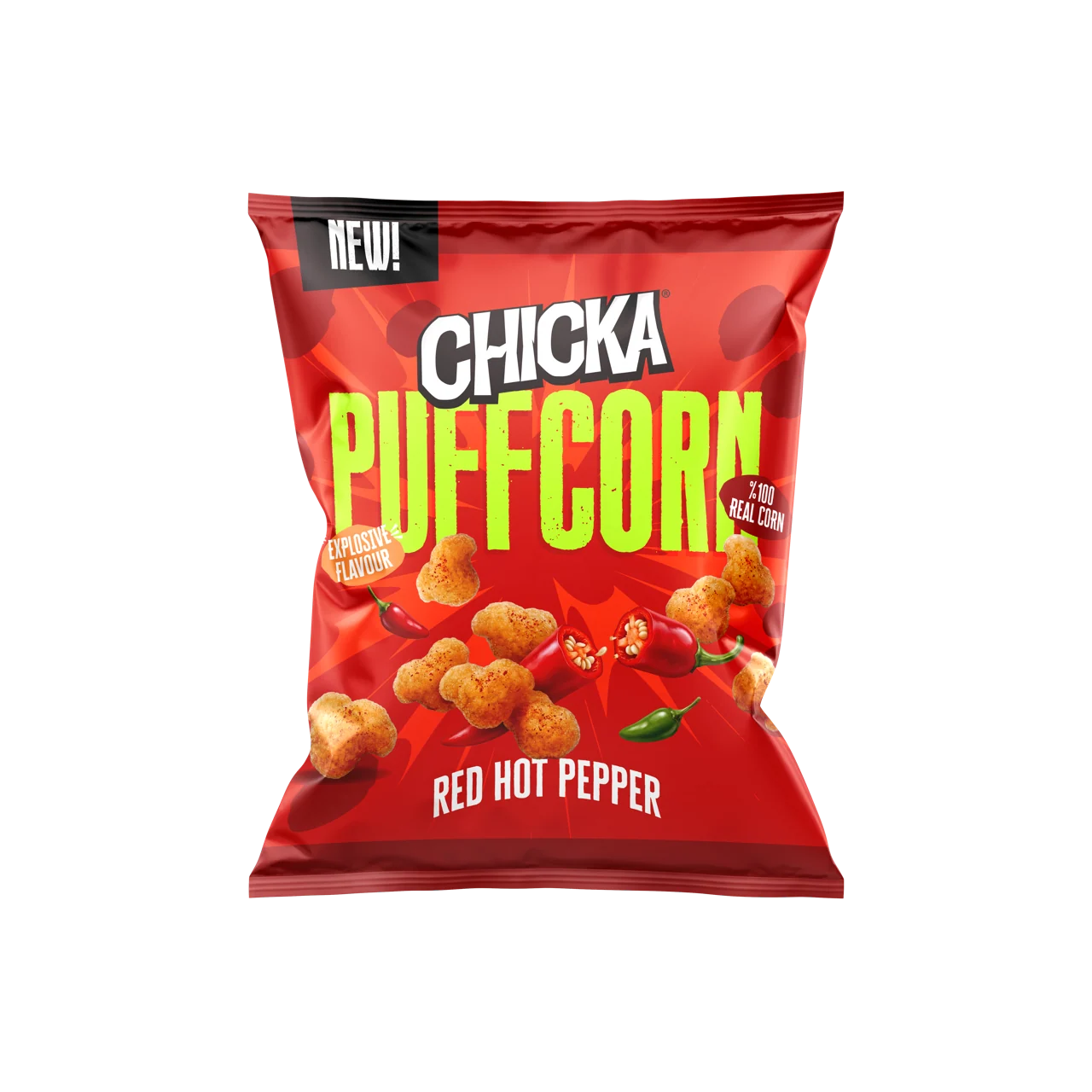

Red Hot Pepper
Hoops
Format
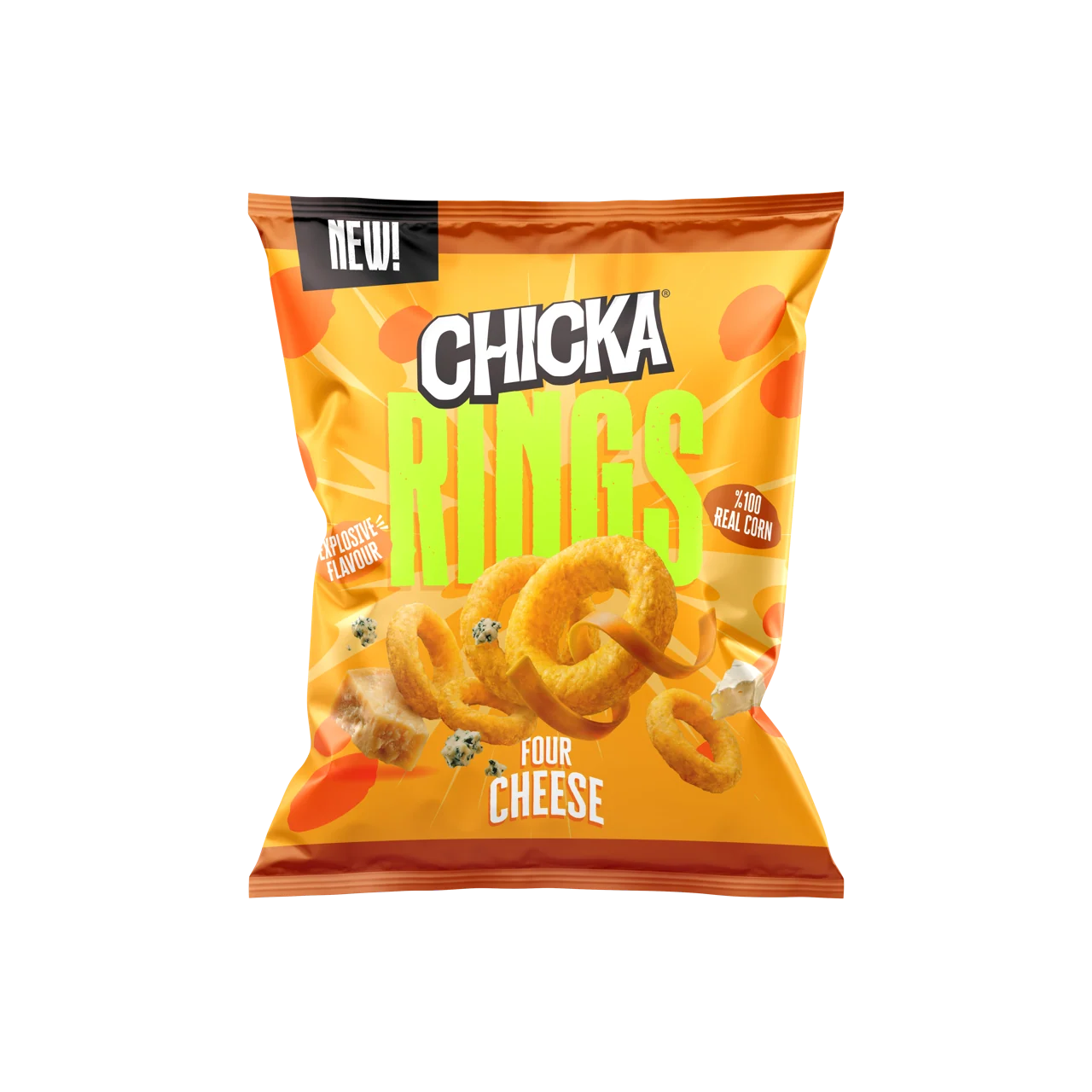
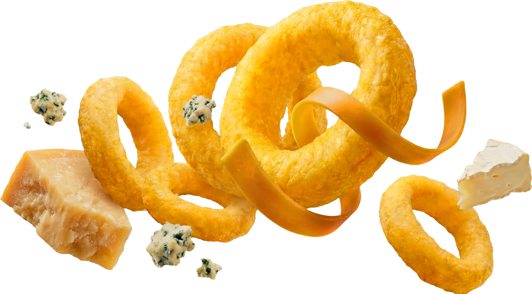
Four Cheese
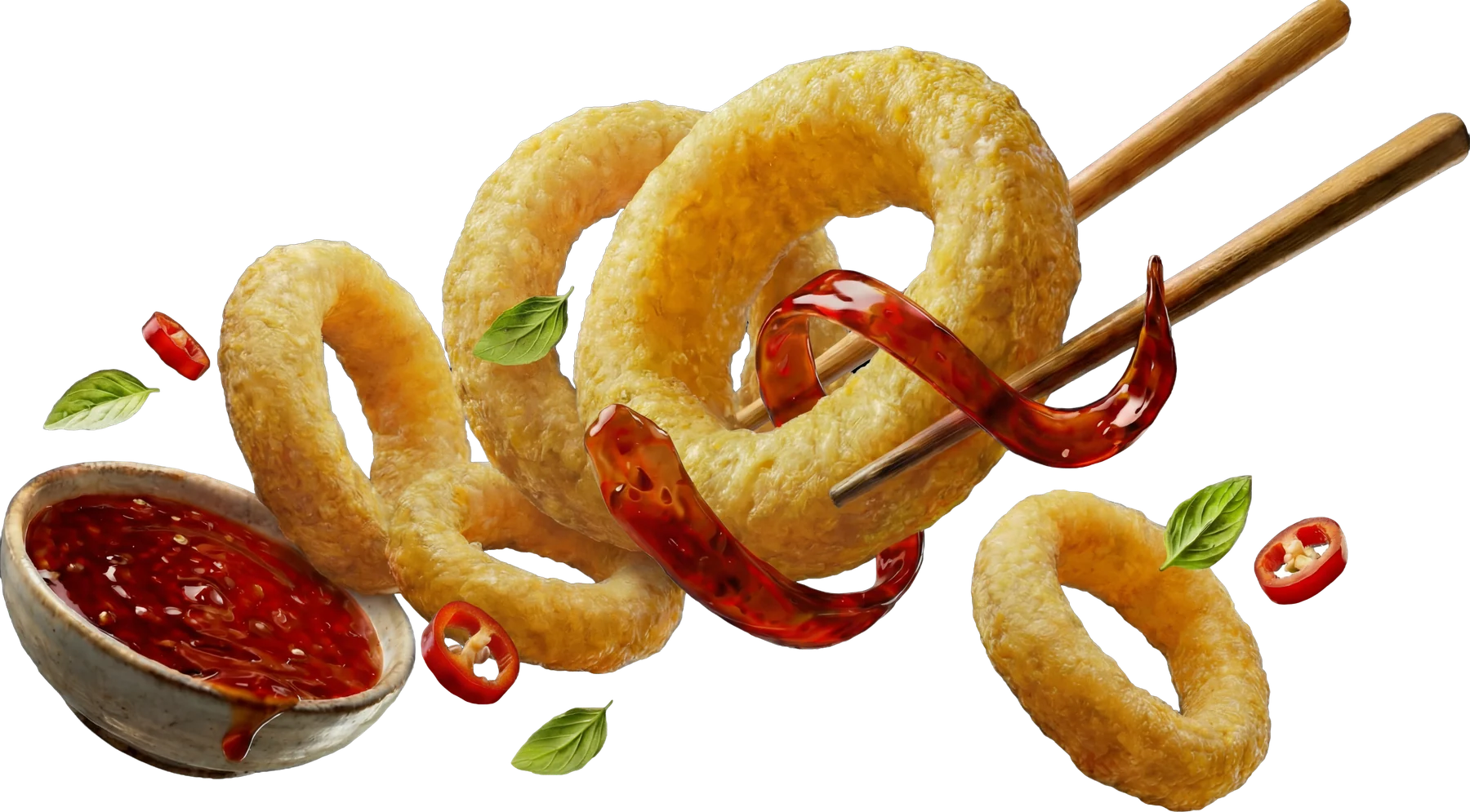
Thai Sweet Chili
Ridged cups
Format
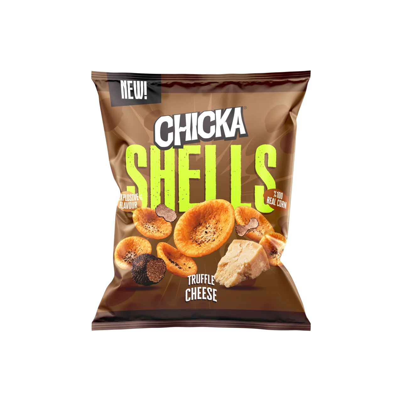
Truffle Cheese

Ghost Pepper Lime
Round balls
Format
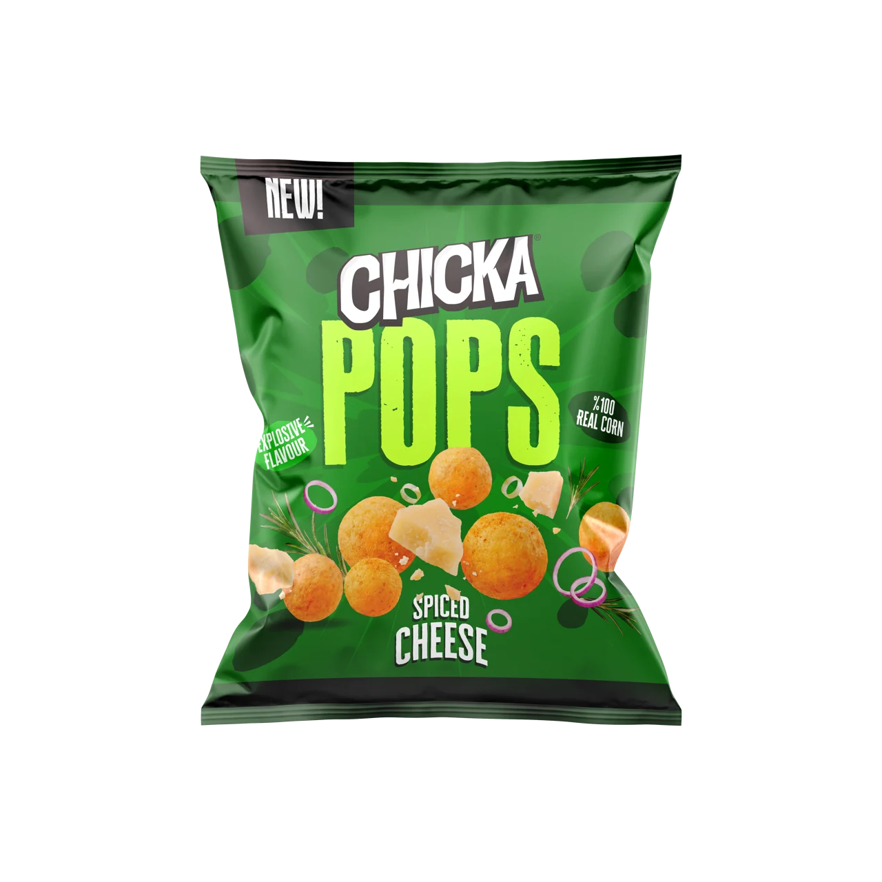

Spiced Cheese
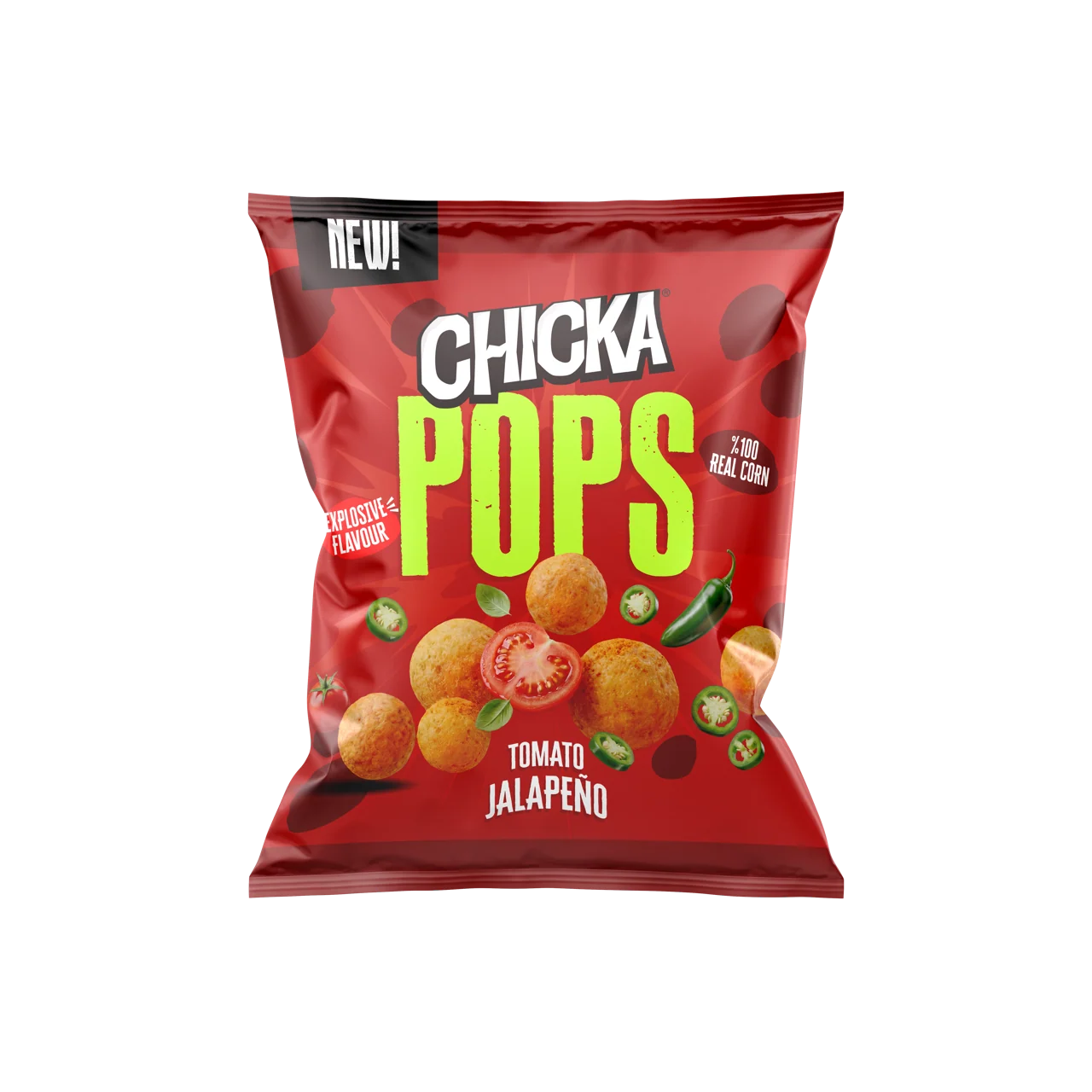
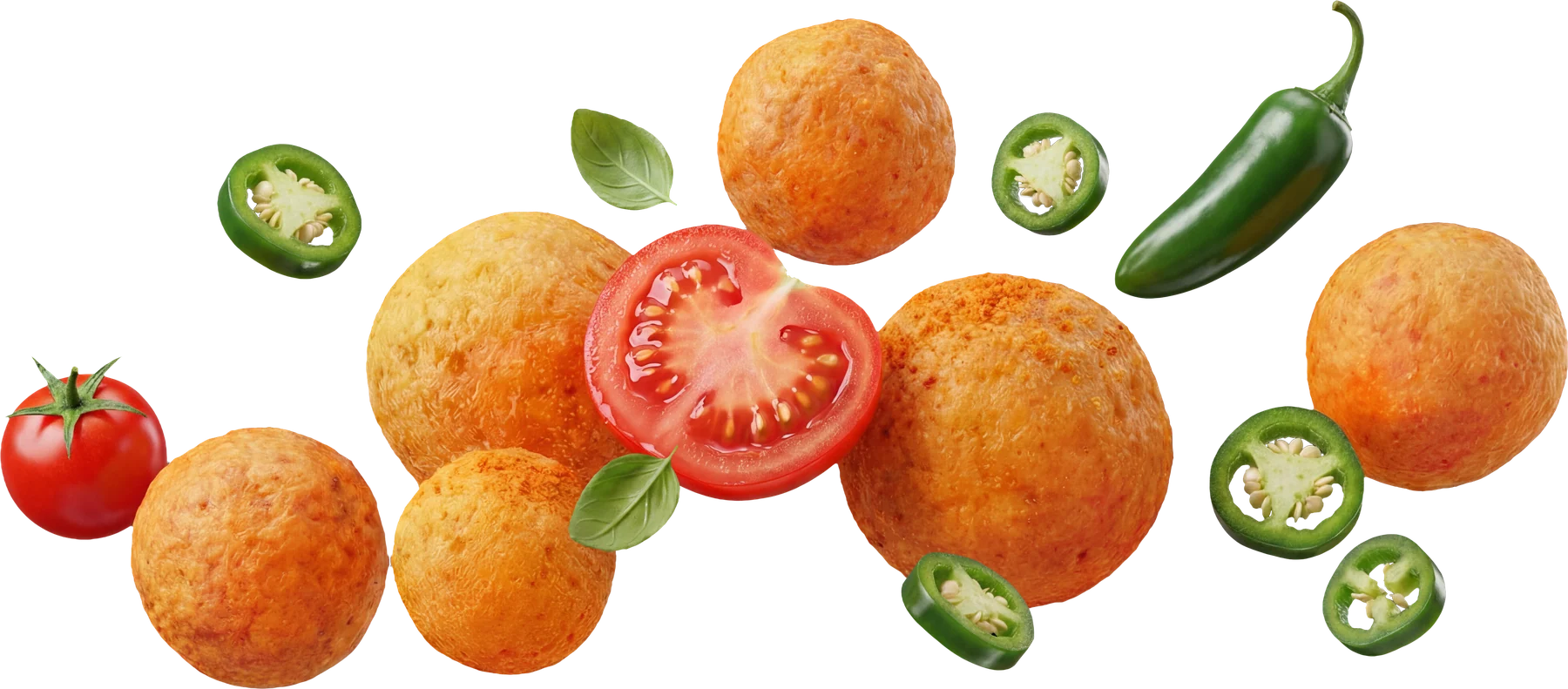
Tomato Jalapeño
Boom
Bite-size pieces, in a stick pack
Format
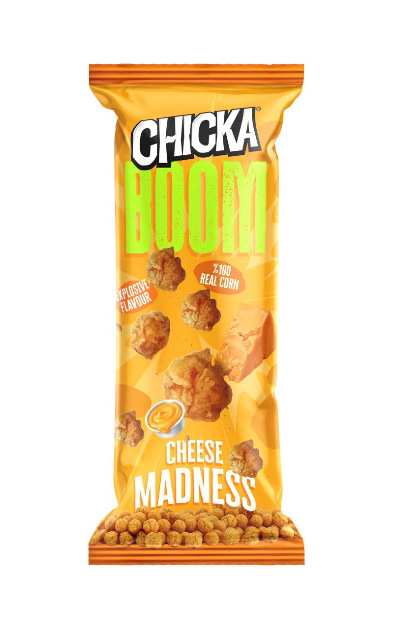

Cheese Madness

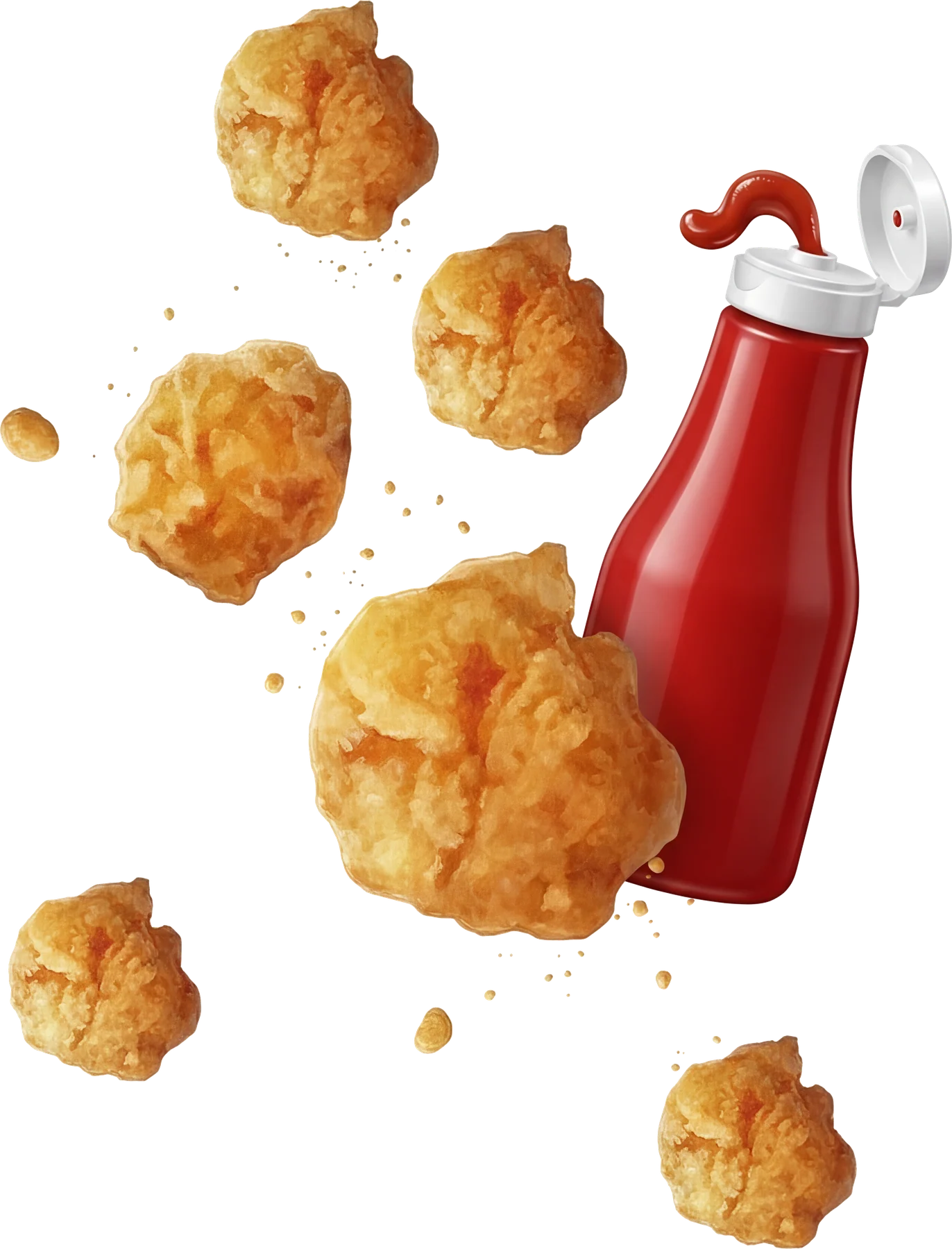
Tomato Ketchup
The rules, checked against the packs
A system is only a system if every pack obeys it. These can be counted on the eighteen packs above.
18 of 18
Character
The cheetah on the core, his spots on the formats.
15 of 15
Format name
The largest thing on every format pack.
3 of 3
Wordmark
The largest thing on every core pack.
18 of 18
Background
Stripes on the core, cheetah skin on the formats.
18 of 18
Flavour
At the foot of the pack, in one position per tier.
10On shelf
Where it stands
Americana approved the direction on 18 February 2026, and the range is now on shelf. This page reports no sales figures. What it shows is the system that was delivered, in use.


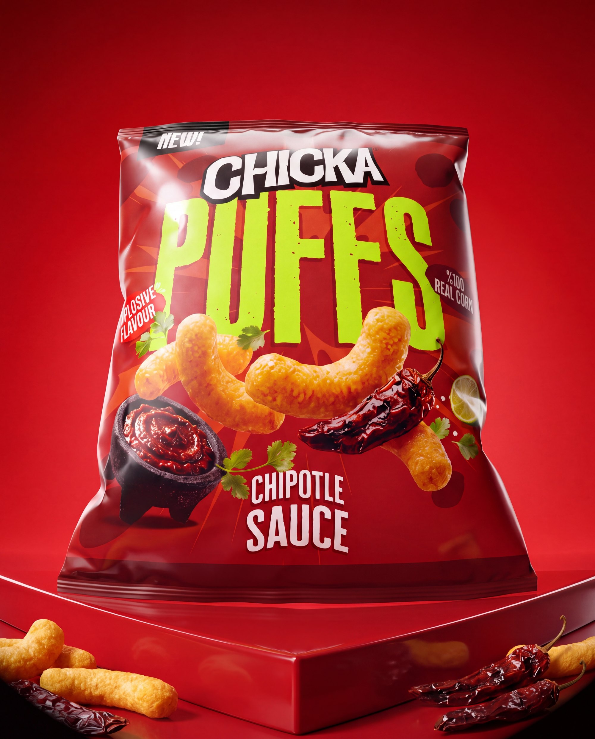


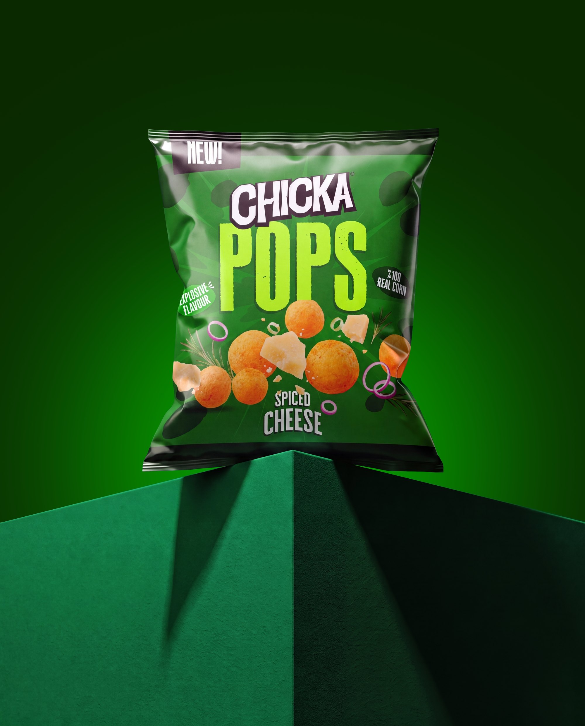


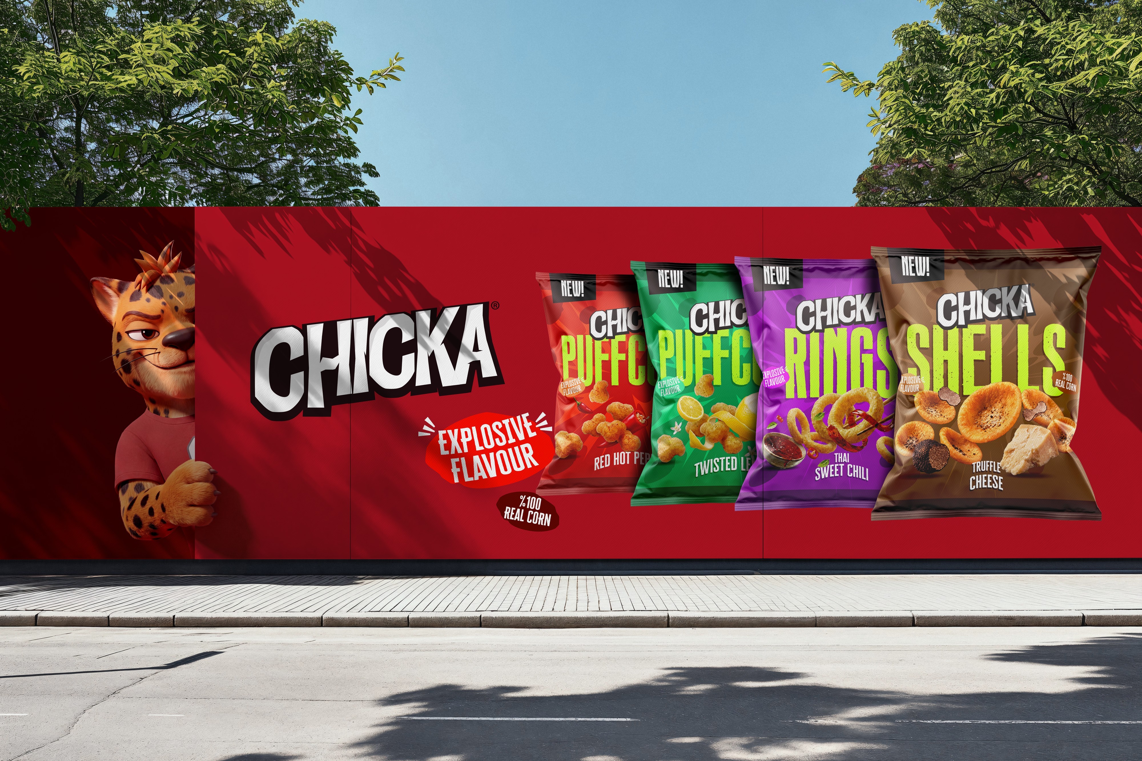

The range was built for one test: a shelf of bags, one metre, three seconds.
Credits
- Client
- Americana Snacks, Marketing Department
- Studio
- Colada
- Scope
- Packaging architecturePack designBrand character
- Brief
- November 2025
- Direction approved
- 18 February 2026
- Range
- 7 lines, 18 packs
- Status
- On shelf