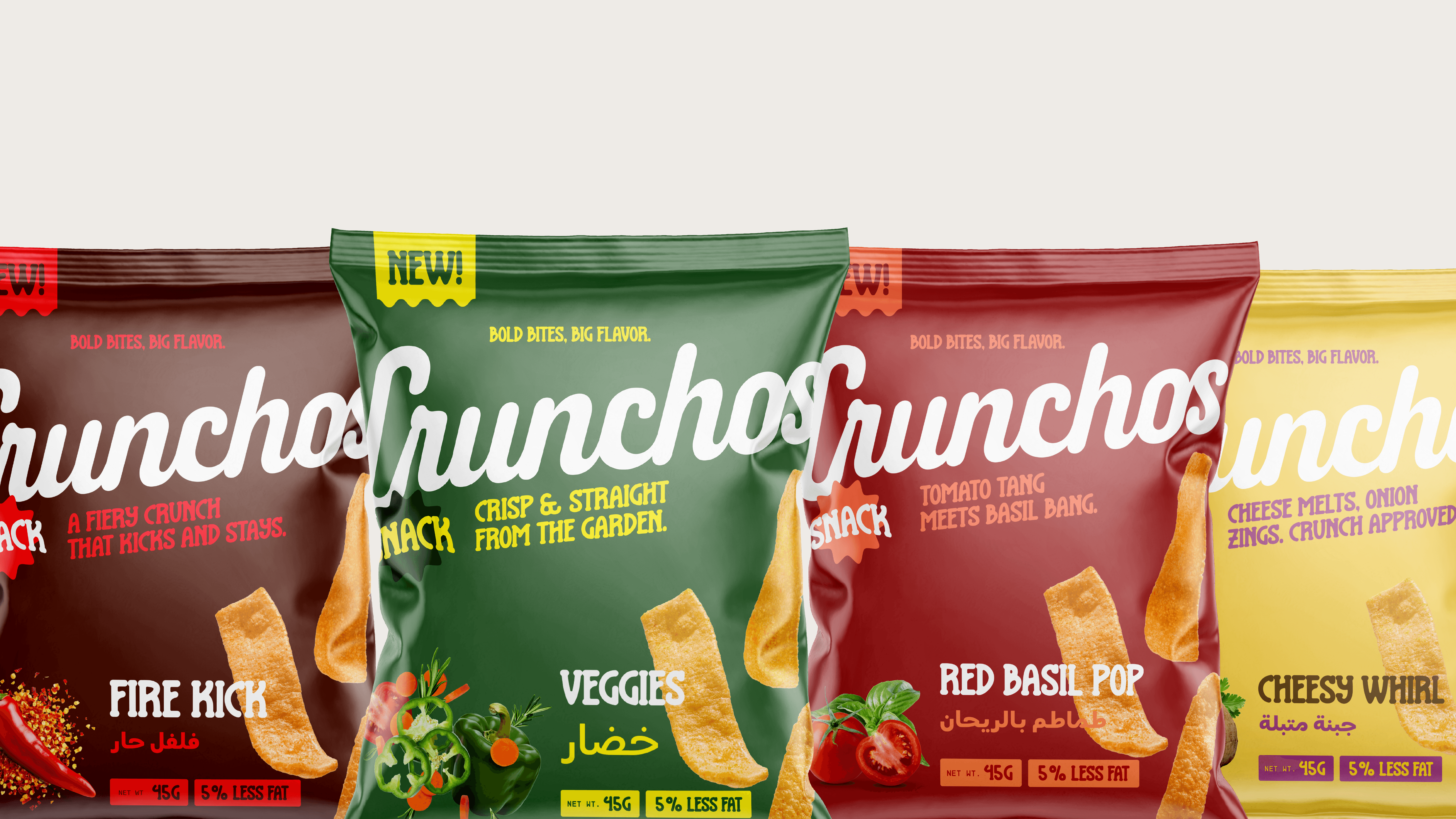

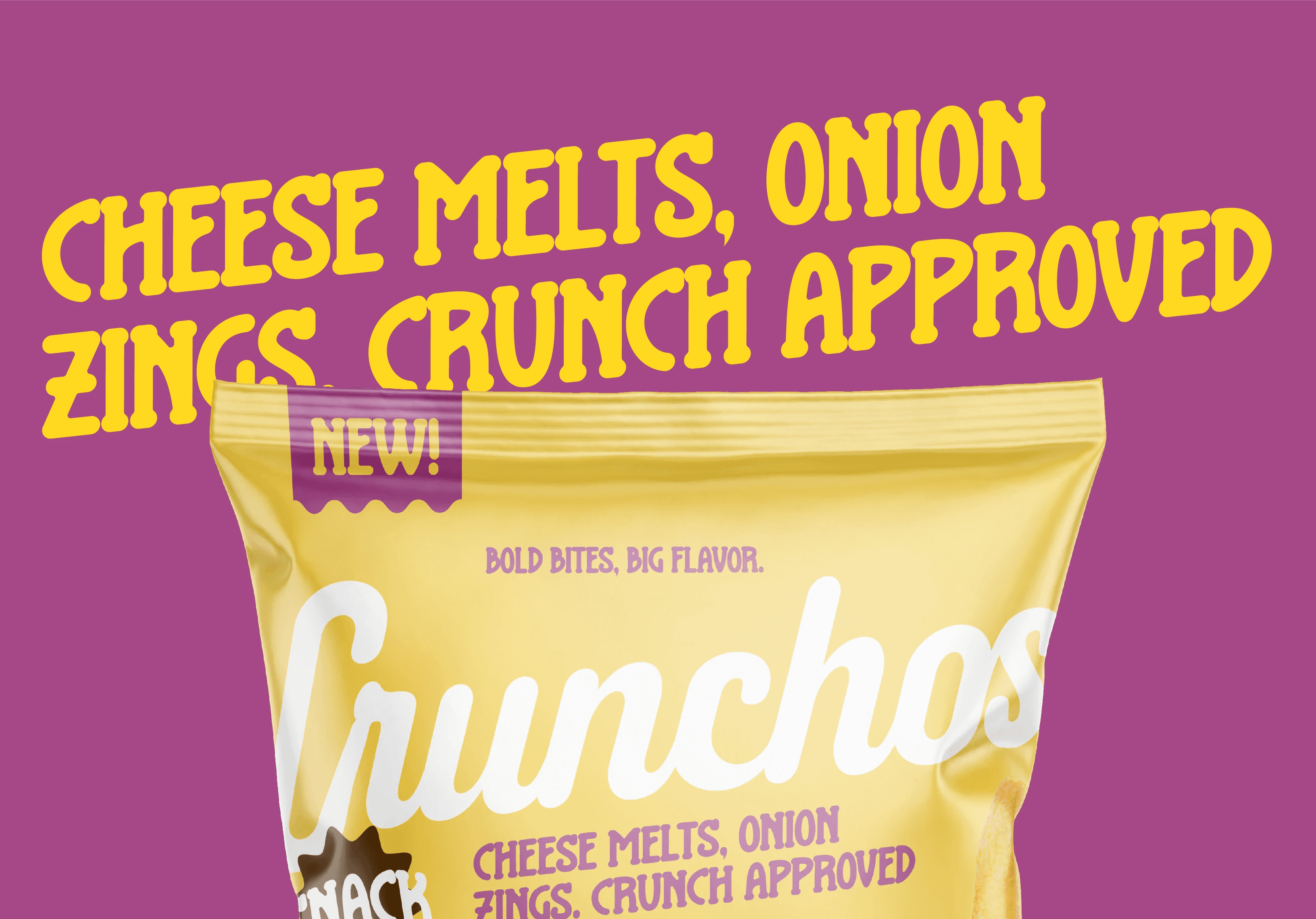
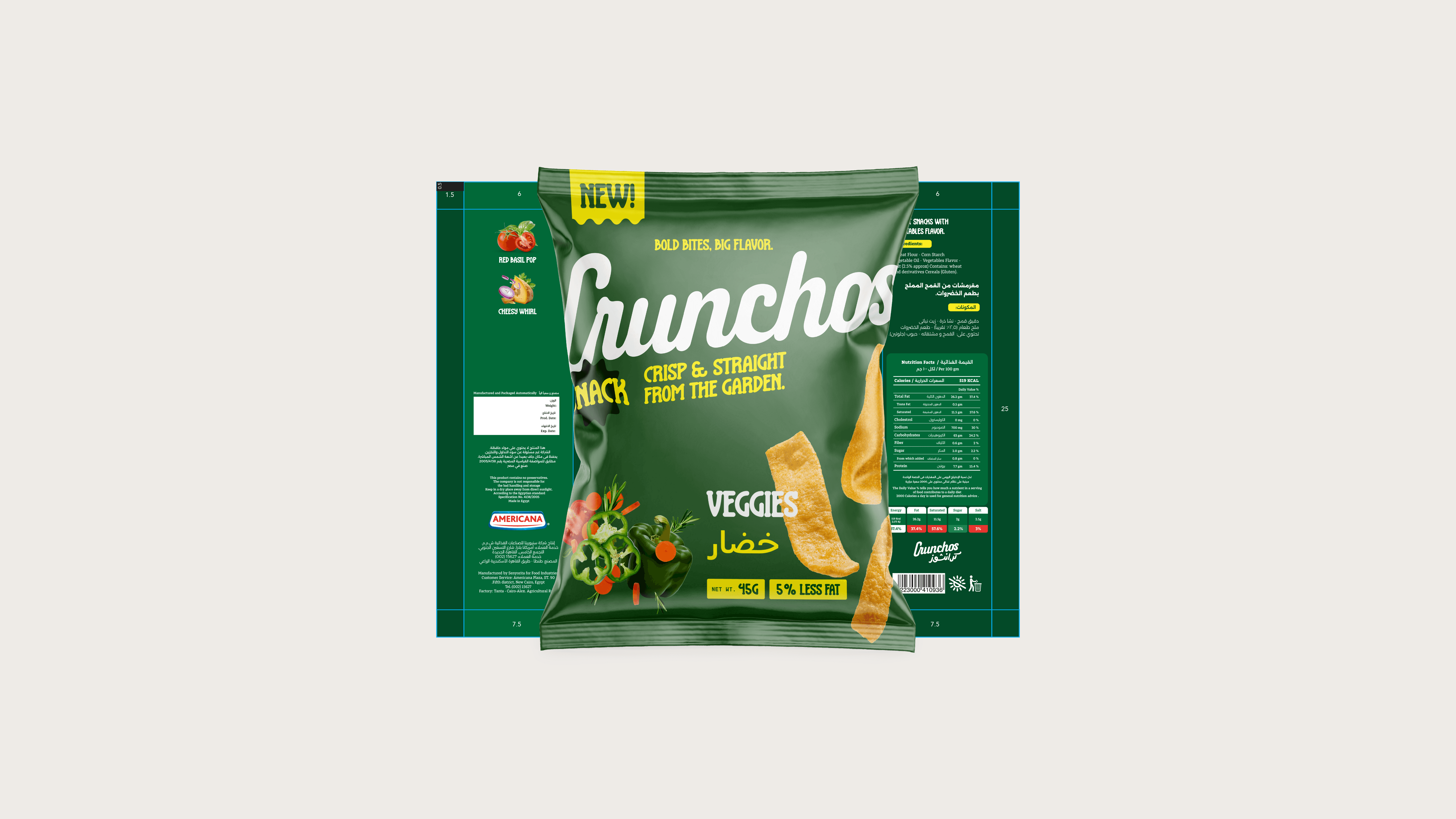
Crunchos was built around a bold, mischievous personality tailored to resonate with Gen Z and young Millennials. The strategy positioned the brand as an all-day companion snack that’s loud, expressive, and irresistibly flavorful. From tone of voice to color psychology, every element was designed to create instant shelf impact and digital engagement. We leaned into exaggerated expressions, oversized typography, and playful messaging to cultivate a brand that thrives on spontaneity and fun, while still feeling premium and curated for trend-conscious youth.


The packaging design for Crunchos balances vibrancy with clarity—using rich background hues and punchy accent colors to differentiate flavors while maintaining a cohesive visual system. We incorporated the signature wavy chip as a dynamic graphic device, anchoring each pack with movement and appetite appeal. The layout maximizes logo visibility while allowing space for playful iconography and variant names, reinforcing both brand consistency and flavor discovery. Designed for both digital and physical shelves, the packs are optimized for instant recognition and shareability.


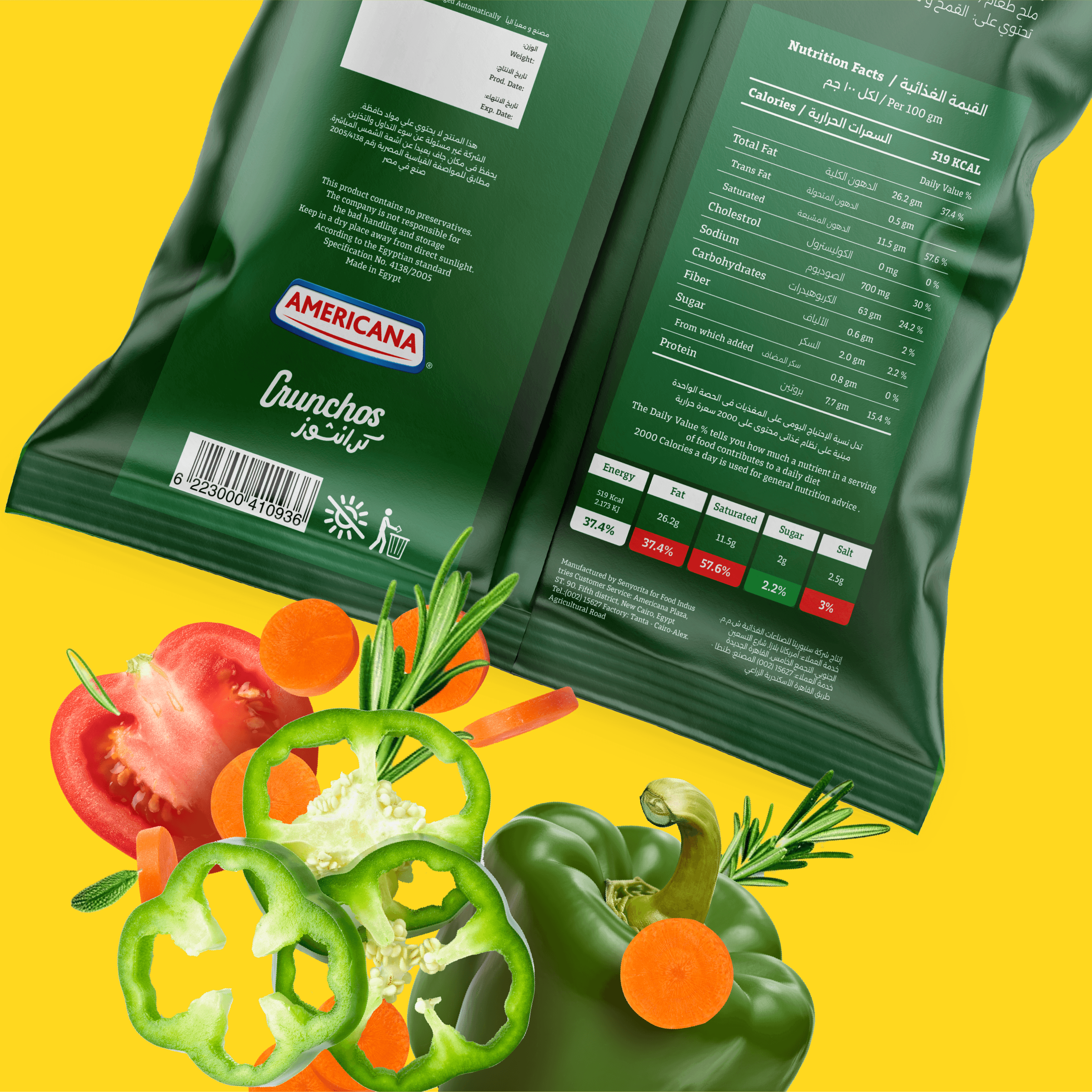
Info


